
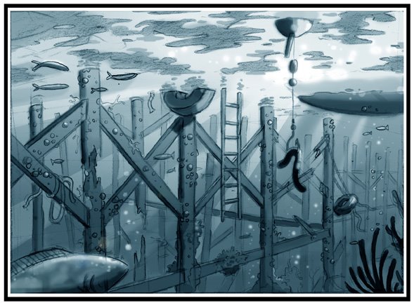
Under Fishing Wharf
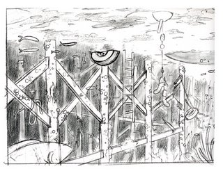
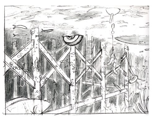
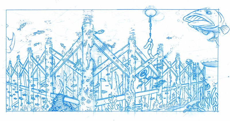
This is my third piece done with black prismacolor pencil on vellum. Water is a tough thing to deal with, it looks so random, but it's really hard to make it look right. I studied some underwater photos and did the best I could to imitate what I saw. Still room for improvement, but am satisfied with the overall look and feel. To show the work in progress, I added my first sketch, a quick PhotoShop rendering and the blue colerase under-drawing. Critique and comments are highly appreciated:)
Just added another version with thicker more underwater-like atmosphere, that seems to work better and more convincing.
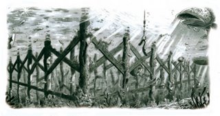
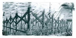


Just added another version with thicker more underwater-like atmosphere, that seems to work better and more convincing.


posted by Hans at 6:01 PM
![]()
![]()


35 Comments:
wonderful drawing!!
the image on top is simply perfect: the contrast of the grayscale, the "camera shot", the complexity of the wooden logs network is amazing. Very credible, it could really exist if there were a cartoon world :-)
Congrats
Yo Hans I love what your doing bro very very inspiring work the vellum seems to be helping add to your awesome sense of play and design bro keep rocking those fresh pics !!!!!
Hey Hans (4:05 am in the morning here in Spain, and I haven't slept yet) Is that true? you got one of my drawings in your cubicle office?. Wow, what an honour, man! thanks. I try to post new pictures the most frequently I can, but I'm busy now (more than 4 projects at the same time, and preparing a fifth -the most ambitious one, comming soon-
bye
greetings from Spain, the country where we don't sleep. :-)
Out and looking for work bro know of any freelance jobs please let me know!!!
beautiful!!! great texture, draftsmanship and lighting!! really great.
Hans,
Great job. It's nice to see you trying different things and challenging yourself with different lighting situations. I also like the fact you posted some of your roughs and underdrawings for us to have a look at. That really helps me give you a better critique.
I wanted to point out to you that your marker rough is working better than your final drawing. In part because it is simpler.
Hans, you need to look at some more underwater photography. You'll notice that the atmosphere is very thick, and detail drops off very quickly as objects recede into the depth. Your final drawing has too much detail in the distance, when in fact those objects should only be seen in silhouette.
In other words, you are trying too hard! Eventhough you are capable of drawing that level of detail, doesn't mean you always should.
Dont worry, I have the same problem. At times I get so enthusiastic with my drawing that I loose sight of the main objective and draw too much detail. When I catch myself, I go back in with my eraser, and take that detail out. You'll have to learn when to step back and objectively look at your drawing. Decide whether or not your beautifully drawn details are working in your favor, or working against you. You should never be afraid to take an eraser to your drawing and erase hours of work.
You are the boss of your drawing, don't let your drawing boss you around.
Thanks for inviting my critique, I hope it helps. It's always a pleasure to share with you what I know.
Hans this is really great. I learn so much from your drawings. I love seeing the process. And the comments from Marcelo are wonderful too. I have an underwater painting in an upcoming book I'm working on, and believe me, you're an inspiration.
Great drawing Hans! Your work always contains such meticulous detail and your skill level is absolutely astonishing.
stellar work my friend!!!
Hey these are all great !!
This comment has been removed by a blog administrator.
niiiicce stuff here layout king... really good feel to it.. I gotta learn do do stuff like this... As for my character on my page.. its for this little short ill be working on.. hes just one of the characters in it... I was sketching him first actually.. But i still gota develop him a bit more...
again nice work you got..
what are you up to these days??
Nice work! You're really good with 'details'.
Hey, Hans!
Great works!! I love them!!
Un abrazo!
H
Wow Hans, these are magical!!
all these drawings are great, i think you captured the sense of underwater-ness well! love the first one, that fish is cool too
ken :D
Thanks everybody. As always, your comments and critique are greatly appreciated:)
Mark: I'm currently working for a studio in Florida doing Visual Development and designs for a series of CG films. Don't wanna get in trouble, so I can't say much more than that:)
Marcelo: Your critique is always a great help and makes me look at my work differently. Thanks a lot:)
Hans
great man,,couple things..
I think you could lose some detail in the bg pier posts, keep the detail in the foreground but knock down the posts in the bg, just allowing the interesting 2 D shape to pop out.IT will alos make the posts in the fg pop... See your PS rendering, it works better then the fully rendered drawing b/c it is simpler and has a better read
I meant to say marker rendering too... I see Mo gave the same advice I did..... genius' think alike.
totally kidding about me being a genius...nice to know that one of the greats had the same pointers as me, very reassuring , sure you knew I learned it from
Hey David,
lol Don't worry, I know what you mean and I can definitely hear that he taught you well:) Great advice and very reassuring for me as well, to hear similar advice from two talents of such caliber. Here's the respond I posted on Marcelos blog.
Hey Marcelo,
Thanks a lot for the critique, it's always a great help and you're absolutely right! One of the things I struggle with the most, is that I'm too neaty with my drawings. I always seem to end up with a ridiculous amount of detail, that often impress a lot of people, but as you said, also works against the overall purpose of the image. It happens when I do the under-drawing . I'm in my own world when I'm drawing and then I zoom in on every inch of the drawing and work with it, as if it was a full layout. I'll definitely try to stop up more often and remind myself what it is I'm trying to show and tell. Would love to see one of your under-drawings, to get an idea how far you take it before transfering to vellum or other medium.
Thanks again for the good constructive critique and advice. It's as always greatly appreciated:)
Have a nice day,
Hans
hello hans!
can't really add too much by way of a critique regarding these images. the nature of the different aspects of this industry is truly amazing, isn't it? i mean, you've got the time to do 4 versions of this image when you work for a feature production. In my case, I'd be lucky if I get a chance to do *two* for television prod purposes. anyway, thanks for posting these and the other images. good luck putting together your portfolio and keep updating - i'll check back as much as i can! talk to you later.
eric.
VERY VERY VERY BEUATIFUL WORKS! Sorry to sound all gushy but its true your layout skills impress da heck outta me.
Hans,
These drawings are wonderful!! Love the vertical design style!! Beautiful stuffs!
PS ... forget to say the lighting and textures create a nice atmosphere!! :)
Hans---Great work man....I love where your going with your work!
Hans, your image works a lot better now. I just compared the before and after images and...WOW...what a difference!
Keep up the great work.
Wow, I really like your backgrounds! That's always been my weakest point, great stuff!
Hans-
NICE work man. So cool to see you pushing the envelope and becoming a better artist on a daily basis!
The new revision with the blurred background really rocks- One of these days I need to take a shot at drawing some amazing backgrounds like you, if I can ever break away from drawing freakish monsters!! Keep the greatness rolling!!!
Shit your work is SAAAAA-WEEEEET!
Keep on rockin that page!
Thanks for posting these, and i really like the photoshop color test you made after the initial drawing.
Your layouts, sense for detail and depth are really strong! Also great lighting. Beautiful.
GREAT MAN!!! WOW Hans, your stuff has really upped the scale. Great piece and wonderful to see how you planned it out. Great man, very impressive and inspirational.
MAC
Great job, I think you succeeded. Wonderful angles and feel.
sweet concept.
Post a Comment
<< Home